
Are you ready for a new website? Or maybe ready for your first website? These freebies will get you started without the overwhelm on a full website. A Launching Soon Page, a Links Page, and a Landing Page. All ready for you.
Download your Free website templates
Is a new website at the top of your list?


Why Website Accessibility Matters
Website accessibility is about making sure that as many people as possible can use and experience your website — including those with visual, auditory, motor, or cognitive disabilities. Beyond being the right thing to do, website accessibility is also a legal consideration. Laws like the Americans with Disabilities Act (ADA) set standards for how accessible digital experiences need to be, and ignoring them can expose your business to risk.
Website builders like Showit provide elements that support accessibility, but it’s ultimately up to the designer — or you, if you’re going the DIY route — to implement them correctly. The good news? A few intentional choices go a long way.
In this post, we’re covering five foundational areas of website accessibility you can address right now: color contrast, alt text, heading structure, navigation, and buttons and links.
1. Color Contrast
Color contrast might seem obvious, but you’d be surprised how often websites fall short. What looks like a solid, readable combination to one person may be completely illegible to someone with a visual impairment — and sometimes our design instincts just get it wrong.
This is why tools like the color contrast checker on Coolors are so useful. When you’re establishing your color palette in the early stages of design, that’s the right time to evaluate contrast — not after everything is built.
A general rule of thumb for website accessibility:
- Normal text: 4.5:1 contrast ratio minimum
- Large text: 3:1 contrast ratio minimum
Make a note of which colors in your palette meet these thresholds for body text, and which should be reserved as accent colors only. If you want to go deeper on this, check out my related post on Choosing Your Website Colors.
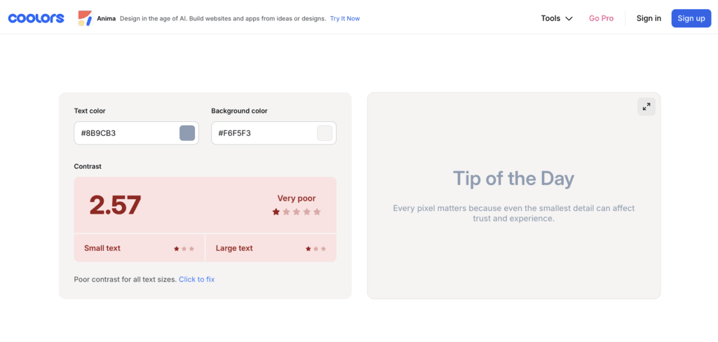
Below is an example of poor color contrast between the text color and the background color.
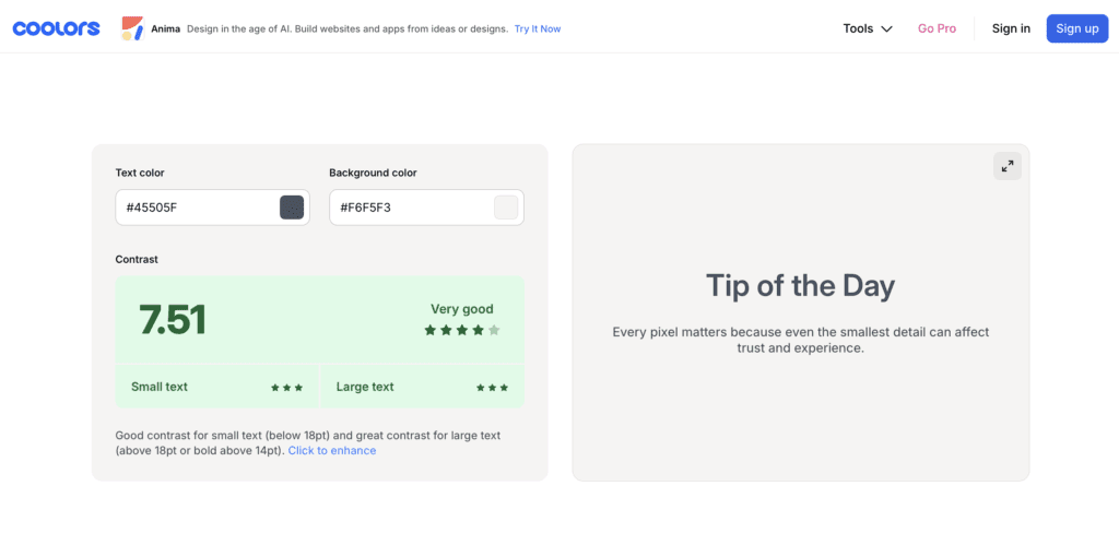
Here is an example of a good color contrast keeping the same background color, and choosing a darker shade of blue for the text color.
2. Alt Text for Images
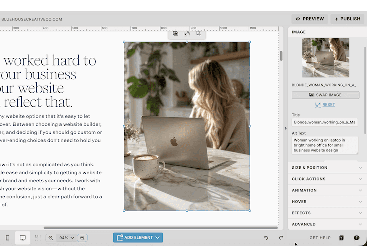
Alt text (short for alternative text) is a brief written description of an image. Every photo on your website should have it. Screen readers use alt text to convey the meaning of an image to users who can’t see it — making it a critical component of website accessibility.
A few important notes:
- Be descriptive and specific. Describe what the image actually shows and why it’s there.
- Don’t keyword stuff. Shoehorning SEO keywords into alt text is a bad strategy. If a keyword fits naturally, great — but the purpose of alt text is context, not rankings.
- Don’t leave it blank. An empty alt text field is a missed opportunity and a barrier for screen reader users.
3. Heading Structure
Think of your heading structure as an outline for your page. It should follow a logical hierarchy that both users and screen readers can navigate with ease.
Here’s what that looks like in practice:
- H1: Used once per page — typically your main page title or hero headline.
- H2: Major sections of the page.
- H3 and beyond: Subsections that fall under an H2.
- P (paragraph): Body copy and general text content.
- Nav: Reserved for navigation elements.
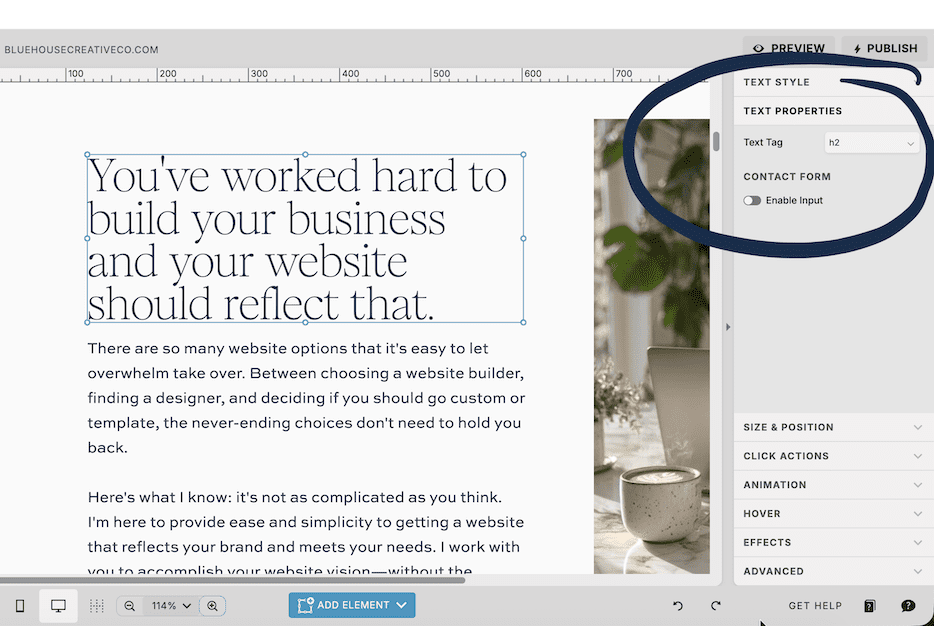
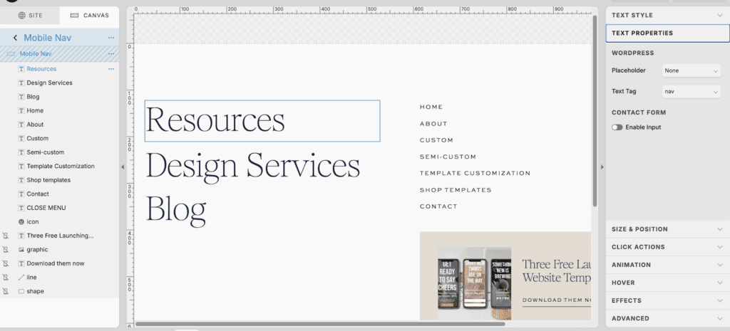
In Showit, you can set the text property for each text element in the Text Properties panel. Skipping heading levels (like jumping from H1 to H3) or using headings purely for visual styling — rather than semantic meaning — can confuse screen readers and hurt both accessibility and SEO.
4. Navigation
Your site’s navigation isn’t the place to get too clever. Familiar placement and predictable structure aren’t design failures — they’re accessibility features.
Here’s what accessible navigation looks like:
- A main navigation at the top of your pages, visible and consistent across the site.
- A footer with a broader set of links and contact information.
- Elements inside each navigation canvas are in a logical tab order, so keyboard users can move through them sequentially.
- Navigation text uses the correct Nav text property in Showit, not just styled paragraph text.
- Navigation has sufficient color contrast — yes, this applies here too.
Tab order matters more than most people realize. Users who navigate by keyboard or assistive technology rely on a logical flow to move through your site. If your navigation canvas elements are out of order in Showit’s layer panel, that flow breaks down.
5. Buttons & Links
The text on your buttons and links needs to do real work. Generic phrases like “Learn More” or “Click Here” tell a screen reader user absolutely nothing about where they’re going or what they’re doing.
Instead, make your button and link text descriptive:
- “Download the Free Guide” — tells users exactly what they’ll get.
- “Learn More About My Design Services” — tells users where they’re headed.
- “Book a Discovery Call” — gives users a clear action and expectation.
A few more things to keep in mind for website accessibility with links and buttons:
- Avoid redundant links. Multiple buttons linking to the same place creates confusion for screen readers.
- Avoid links on top of links. Overlapping clickable areas are difficult to navigate with a keyboard or screen reader.
Start Small, But Start Now
This isn’t an exhaustive list — website accessibility is a broad topic with evolving standards — but these five areas are an excellent starting point. Small, intentional changes can make a meaningful difference in how many people can fully experience your website.
Once you’ve worked through these basics, consider installing the WAVE Evaluation Tool browser extension. It scans your pages and flags accessibility issues so you can see at a glance where improvements are needed. Technology and standards continue to evolve, so staying informed is an ongoing practice — but getting the fundamentals right is the best place to begin.
About the Author
Hi, I’m Emily — a Showit website designer based in Worcester, MA, and the founder of Blue House Creative Company. I’m a twin mama who traded a career in retail management and visual merchandising for full-time creativity (and full-time toddler chaos). I went back to school for my MBA because I believe that great design and smart strategy should always go hand in hand.
At Blue House Creative Co., I design websites that are beautiful AND functional — because form and function need to live together. Whether you’re starting from scratch or ready to level up your current site, I’d love to help you build a website that works as hard as you do.
View My Design Services | Explore Website Templates
Have questions about making your Showit website more accessible? Feel free to reach out — I’m always happy to help.
Hi! I'm Emily. I'm a stay-at-home mom who accidentally learned web design while growing my side hobby. When I wanted a website for the Etsy shop I was outgrowing, I realized that learning how to do-it-myself was way more fun than anticipated. And that's how Blue House Creative Company began.
Because I think WE Should be friends
Have we met yet?

blog Home
Web Design
Fonts & Colors
Marketing
Personal


Fonts & Colors

Web Design

WEb Design

Fonts & Colors
Here's What to Read Next
Explore categories

Personal
From web design basics, design inspiration, digital marketing tips and tricks i've learned along the way, to the personal posts that let you know you are not alone. It's all here.
Explore Catagories
blog Posts to binge & save

Marketing

Fonts & Color Inspo

WEb Design
Take a freebie
Are you ready for a new website? Or maybe ready for your first website? These freebies will get you started without the overwhelm on a full website. A Launching Soon Page, a Links Page, and a Landing Page. All ready for you.
Pick one or pick them all
All of the Freebies
Free Launching Soon Template
Start Here

Free Bio Links Template
Help is on the way!

Free Landing Page Template
One full landing page


