Explore All Blog Categories
Personal
Marketing
Fonts & Colors
Web Design
Blog Home
Personal
Marketing
Fonts & Colors
Web Design
blog Home
Okay, so here’s the thing about website colors
Colors are important. They are quietly telling your visitors what kind of experience they are about to have with you.
Are you the buttoned-up professional or the creative wildcard? Fast-paced or calming? Budget-friendly or luxury? Your colors answer these questions before they read a single word on your homepage.
This blog post is my guide for picking website colors that actually make sense for your brand, and not just colors that look nice.
What your colors are actually saying
Warm colors (reds, oranges, yellows, warm neutrals) feel energetic and bold. They work if you want to come across as creative, passionate, action-oriented. Just don’t go overboard—too much warm and it starts feeling aggressive or chaotic.
Cool colors (blues, greens, purples, cool greys) feel trustworthy and calm. They’re great for service businesses, wellness, education, anything where you want people to feel at ease. The downside? Too much cool can feel distant or corporate.
Here’s what most people miss: it’s not warm versus cool. You need both. The trick is usually picking one or two standout colors for buttons and calls-to-action, then balancing everything else with neutrals so it doesn’t feel like a visual cachophony.
Start with a moodboard, not a color wheel
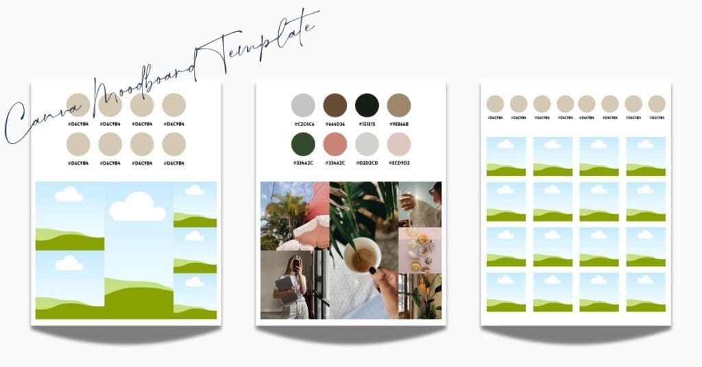
Whenever I’m working on a website, whether it’s a custom design or a template customization, I always start with a moodboard. A moodboard is a collection of images that capture the feeling of the brand. These images could be inspiration photos, your existing brand shots, logo, honestly whatever captures the vibe you’re going for.
When all of these images are placed together on the moodboard, I then look for patterns. What colors keep showing up? What tones feel consistent? I pull those colors directly from the images until I have a rough color pallet. I generally do this in Canva, I have a moodboard template for you to download here.
The main point of this exercise is to ensure you’re not picking colors in a vacuum. That you’re making color pallet decisions based on actual images so you can see how the colors will work with each other. You’re making sure they work together and actually reflect the feeling you’re trying to create. This is far more reliable than scrolling through Pantone swatches and hoping for the best (also far less overwhelming).
Turning your moodboard into an 8-color palette
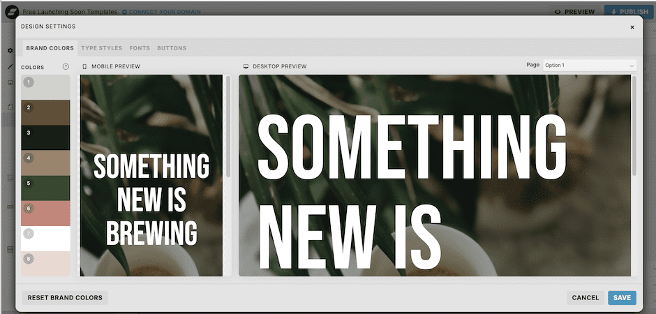
Once you’ve got your moodboard sorted, you need to narrow it down to 8 colors for your Showit Design Settings. Here’s what those usually break down to:
- Primary brand color
- Secondary brand color
- Accent color (buttons, CTAs, anything you want people to click)
- Light neutral (backgrounds)
- Dark neutral (text)
- Soft background tone
- Highlight or hover color
- Optional flex color (seasonal stuff, special promos, etc.)
After you pick them, take a moment and think: Does this palette match how you want people to feel on your site? If your brand was a physical store and these colors represented the merchandise, would it feel like your store? Or would something feel off?
If anything feels off, go back to your moodboard. Either the colors need tweaking, or the images on your moodboard aren’t actually representing your brand. Sometimes you just need to step away for a bit—go for a walk, work on something else. Sometimes design problems solve themselves better when you’re not staring directly at them.
Don’t skip the accessibility check
Good design is also accessible design: if people can’t read your text, your color palette doesn’t matter. There are actual legal requirements for color contrast, and honestly, it just makes good sense.
- Normal text (body copy, smaller headings): needs at least 4.5:1 contrast
- Large text (big headings): needs at least 3:1 contrast
I use the Coolors Contrast Checker. Takes two seconds, and it’ll even suggest color fixes if your contrast is too low.
The whole process, start to finish
- Decide what feeling you’re going for
- Build your moodboard (inspiration, real brand photos, logos, etc.)
- Notice whether you’re leaning warm or cool
- Pull your 8-color palette
- Run an accessibility check
- Use it consistently across your whole site
The best color palette isn’t the one that’s trending on Instagram right now. It’s the one that feels aligned with who you actually are and makes it easy for people to engage with your site.
That’s it! Go make something that feels like you!
Need help? Check out my website design services!
Have we met yet?
Because I think WE Should be friends
Hi! I'm Emily. I'm a stay-at-home mom who accidentally learned web design while growing my side hobby. When I wanted a website for the Etsy shop I was outgrowing, I realized that learning how to do-it-myself was way more fun than anticipated. And that's how Blue House Creative Company began.
Explore All Blog Categories
Personal
Marketing
Fonts & Colors
Web Design
Blog Home
Personal
Marketing
Fonts & Colors
Web Design
blog Home
Here's What to Read Next
Fonts & Colors
9 Elegant Google Fonts You’ve Probably Never Heard Of
WEb Design
Basic SEO Website Design Tips for Your Showit Website
Web Design
What to Look for in a Showit Website Template
Fonts & Colors
Handwritten Google Font Inspiration For Your Spring Projects


Explore categories
WEb Design
Fonts & Color Inspo
Marketing
blog Posts to binge & save
Explore Catagories
From web design basics, design inspiration, digital marketing tips and tricks i've learned along the way, to the personal posts that let you know you are not alone. It's all here.
Personal

Take a freebie
One full landing page
Free Landing Page Template
Help is on the way!
Free Bio Links Template
Start Here
Free Launching Soon Template
All of the Freebies
Pick one or pick them all
Are you ready for a new website? Or maybe ready for your first website? These freebies will get you started without the overwhelm on a full website. A Launching Soon Page, a Links Page, and a Landing Page. All ready for you.


