Explore All Blog Categories
Personal
Marketing
Fonts & Colors
Web Design
Blog Home
Personal
Marketing
Fonts & Colors
Web Design
blog Home
You’ve spent hours scrolling through Google Fonts, and somehow your website still looks… off. I get it. I’ve lost entire afternoons on Creative Market, clicked through every font in Canva, only to realize the one I like doesn’t make sense with anything else. When your fonts aren’t right, your whole website just feels wrong.
The good news? Font pairing is one of the fastest ways to make your site look professional. And you don’t need to be a designer to get it right. By the end of this, you’ll have five formulas you can use today.
Quick Font Basics
Let’s get on the same page first. A typeface is the overall design of the letters. A font is a specific style within that design. Typography is how you arrange all the letters together.
There are four main categories of typeface you need to know:
Serif fonts have little feet at the end of letters. Think Times New Roman. They feel classic and trustworthy.
Sans serif fonts are clean, no decorative bits. Like Arial. They’re modern and easy to read.
Script fonts look like cursive or handwriting. They’re elegant but hard to read in long chunks, so use them sparingly.
Display fonts are bold and stylized. Great for headlines, terrible for paragraphs.
When you’re mixing typefaces, contrast is good, but too much contrast is chaotic. You need enough difference to create visual interest, but not so much that it feels all over the place.
It’s ideal to mix 2-3 fonts or typefaces together, more than that and you’ve entered the chaos zone.
Formula #1: Classic Serif + Sans Serif
The Pairing: Playfair Display SC, Playfair, Source Sans 3
This is the combo that always works. Serif for headings (classic, authoritative), sans serif for body text (clean, readable). It’s perfect if you need to look established but approachable.
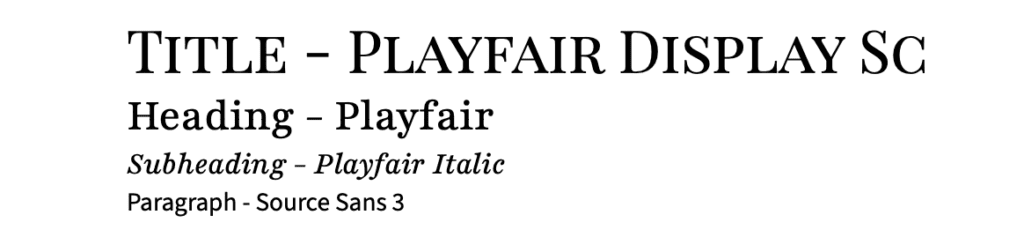
How to use it:
- Title: Playfair Display SC
- Heading: Playfair
- Subheading: Playfair Italic
- Body: Source Sans 3
Use serif for headings to grab attention, sans serif for body text for ease of reading.
Formula #2: Elegant Script + Simple Sans Serif
The Pairing: Sacramento, Josefin Sans
Script adds personality, sans serif keeps it readable. This works great for anything that needs to feel elegant but still professional.
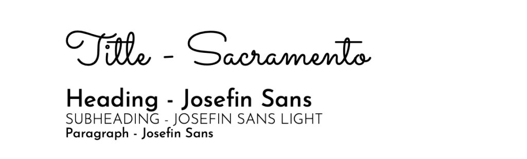
How to use it:
- Title: Sacramento
- Heading: Josefin Sans
- Subheading: Josefin Sans Light
- Body: Josefin Sans
Only use script for main headings or your logo. Never for body text. And never in all caps, it’s near impossible to read.
Also, be careful with script fonts. While they add a lot of personality, they can look dated quickly.
Formula #3: Bold Modern (Two Sans Serifs)
The Pairing: Oswald Bold, Jost
You can absolutely pair two sans serifs. Just use weight and style to create contrast instead of mixing font types. This gives you a really clean, modern look.
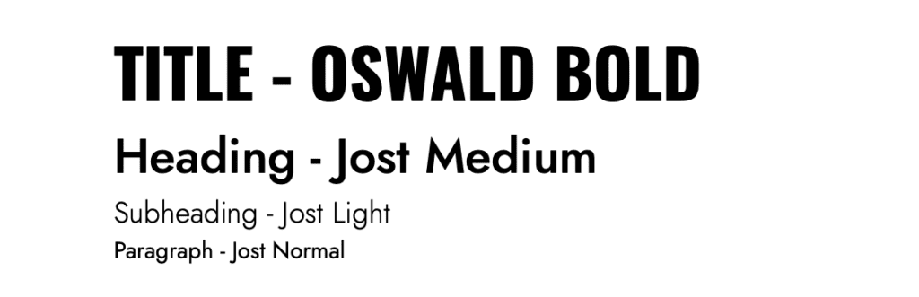
How to use it:
- Title: Oswald Bold
- Heading: Jost Medium
- Subheading: Jost Light
- Body: Jost Normal
Works great for modern brands, anyone going for a clean, minimalist vibe.
Make sure one font is way bolder than the other. If they’re too similar, you could be entering the chaos zone.
Formula #4: Editorial Serif Pair
The Pairing: Besley, Crimson Text
Pairing two serifs? Yes, please! But it’s tricky. You need one decorative serif and one simple serif. This combo feels literary and sophisticated.
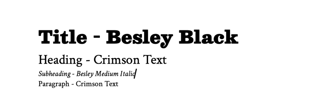
How to use it:
- Title: Besley Black
- Heading: Crimson Text
- Subheading: Besley Medium Italic
- Body: Crimson Text
Use the decorative serif (Besley) only for big headings. The simpler one (Crimson Text) handles everything else. And make your size differences really obvious.
Two serifs can be difficult to pull off. But when it works, it’s beautiful.
Formula #5: Statement Display + Neutral Foundation
The Pairing: Bebas Neue, Alata
Display fonts are your personality move. They’re bold and memorable. Pair them with something neutral so everything else stays readable. Great for bold, clean brands, anyone who wants to stand out.
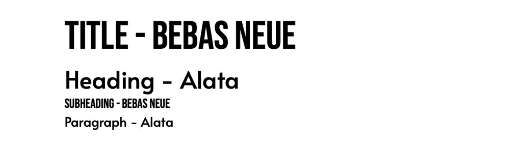
How to use it:
- Title: Bebas Neue
- Heading: Alata
- Subheading: Bebas Neue
- Body: Alata
Use display fonts only for hero headings or special callouts. A little goes a long way.
Technical Stuff for Showit
Showit gives you access to the entire Google Fonts library (1,500+ fonts). In addition to these, you can also add custom fonts that you have licensing to use. Learn more about how to add fonts and typefaces here.
Mistakes to Avoid
- Don’t use more than 3 fonts. It’s too much.
- Don’t pair fonts that look too similar. You’re creating confusion, not hierarchy.
- Don’t use script for body text.
- Don’t prioritize style over readability. If people can’t read it, it doesn’t matter how it looks.
- Be sure to test on mobile. What works on your laptop might not look so great on a phone.
Just Start Experimenting
Good font pairing is really just about contrast, hierarchy, and knowing when to stop. Pick one of these formulas and try it out. Adjust the sizes, play with the weights, see what feels right for your brand.
These formulas work. I’ve used them, and they’ll work for you too.
Have we met yet?
Because I think WE Should be friends
Hi! I'm Emily. I'm a stay-at-home mom who accidentally learned web design while growing my side hobby. When I wanted a website for the Etsy shop I was outgrowing, I realized that learning how to do-it-myself was way more fun than anticipated. And that's how Blue House Creative Company began.
Explore All Blog Categories
Personal
Marketing
Fonts & Colors
Web Design
Blog Home
Personal
Marketing
Fonts & Colors
Web Design
blog Home
Here's What to Read Next
Fonts & Colors
9 Elegant Google Fonts You’ve Probably Never Heard Of
WEb Design
Basic SEO Website Design Tips for Your Showit Website
Web Design
What to Look for in a Showit Website Template
Fonts & Colors
Handwritten Google Font Inspiration For Your Spring Projects


Explore categories
WEb Design
Fonts & Color Inspo
Marketing
blog Posts to binge & save
Explore Catagories
From web design basics, design inspiration, digital marketing tips and tricks i've learned along the way, to the personal posts that let you know you are not alone. It's all here.
Personal

Take a freebie
One full landing page
Free Landing Page Template
Help is on the way!
Free Bio Links Template
Start Here
Free Launching Soon Template
All of the Freebies
Pick one or pick them all
Are you ready for a new website? Or maybe ready for your first website? These freebies will get you started without the overwhelm on a full website. A Launching Soon Page, a Links Page, and a Landing Page. All ready for you.


